


Picking Paint Colors For Better White Balance
when we bought our current home, i was so excited to paint. and not for the reasons you think. it really had nothing to do with decor, it had all to do with photography. i really wanted to create rooms that would photograph well by picking paint colors for better white balance. and also because…i really love to paint. it always amazes me how something as simple as wall color can completely transform a room.
let me be clear, the paint colors that work for my house may not work for yours. there are so many things to consider when picking paint colors for better white balance, such as how much light your home gets and what color casts come through your windows. some of my friends adore the paint colors in my home, but when they went to paint the same colors in their home…it simply didn’t work. but since you all ask, i will tell you about my paint and give you some tips for choosing your own paint.
do you want your home to be more photographable? be sure to read how to design a room that will photograph well for 5 easy tips.
Picking Paint Colors For Better White Balance
.jpg "Picking Paint Colors For Better White Balance | Bethadilly Photography")
this post contains affiliate links. thank you in advance for supporting bethadilly photography.
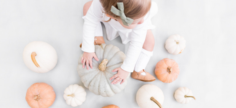
Think Neutral
not only is neutral timeless, classic, and clean, but it also photographs really well. having a neutral and soft color on your wall will help ensure that your wall color adds a natural and neutral feel to your photos, allowing your subject to be the main focus. think oatmeal and soft grays. i find that my style is close to joanna gaines’ (by the way, her book is amazing) in that i like timeless and classic colors that are soft and neutral and don’t steal the show. your walls should help to tell the story, not be the story.
Avoid Loud Colors
say no to any primary colors or anything that is bright or loud. bright colors on walls make for terrible photos because they create color casts on skin. colors like pink, orange, red, bright blues, greens, purples will create unnatural skin tones on your subjects. the skin will soak in and reflect the bright color of the wall, making the skin tones look unnatural and affecting your white balance in a negative way.
.jpg "Picking Paint Colors For Better White Balance | Bethadilly Photography")
the final colors chosen for my home were dolphin fin and silver ash, both behr ultra premium paints.
Consider All The Factors
every home is so different based on the home’s light and what is outside it’s windows. for my home, i have a lot of trees outside of my windows so that affects the color on my walls, and affects what paint color i choose. when picking paint colors for better white balance, you must consider all of the factors that affect your wall color. does it work with the color casts coming in your windows? does it work with or clash with your furniture? does it work with your available natural light? as i said, the paint colors that rock on my walls may be completely different for you.
Bring Home A Variety of Samples
once you decide on some paint colors, bring home samples of each color. your home improvement store should have small pints that they can mix up for you, allowing you to test the color before investing in gallons of paint. i believe these test jars are around $3-$4. and they are worth every penny. just because paint looks good on a paint chip does not mean it looks good on your walls. i have even brought paint chips home and hung them on my walls, but nothing is as accurate as actually painting test strips on your walls with the actual color.
bring a variety of samples home in a variety of shades. i believe i tried about 9 neutral shades, everything from light browns to soft grays, when photographing my home office. by painting your samples on a variety of walls that get different light and right next to one another, you will definitely get a feel for what looks best for your space. i found it easiest to use foam brushes to sample paints as you can use a different brush for each color and dispose of them afterwards.
Choose Lighter Colors
you know when you paint a room and suddenly feel like it is brighter? well, it is. choosing lighter neutrals can help to brighten up a room, making it easier to photograph in. this may not be the case for every room, as window light is a huge factor, but lighter paint can help lend a brighter tone to your room. and don’t we all love a nice bright room when it’s time to bring out our camera?
Test For Color Casts
stand next to your paint sample that you tested on your wall and see if it casts any unnatural color onto your skin. when picking paint colors for better white balance, you want a paint that is neutral and won’t interfere with skin tones. if you find that your paint color is lending color casts onto your subject, it may be best to avoid it.
picking paint colors for better white balance is going to be different for everyone as everyone’s home is different. however, the tips are the same. remember that neutral is better and that loud colors will be a nightmare for white balance. take your time and be thorough as you choose your wall color as you try soft neutrals and test how the light in your home changes each color. have fun with it!
be sure to join my exclusive email list to receive my latest photography tips and tutorials. it’s free!
need some photography tips + inspiration? check out what posts are trending below!
How To Design a Room That Will Photograph Well » bethadilly - […] did you know paint colors play a huge role in your photographs? read how to pick paint colors for better white balance. […]