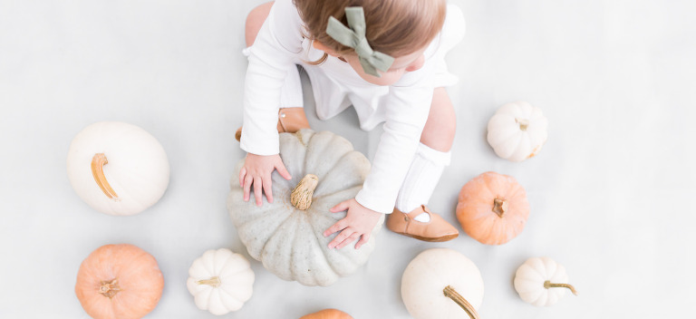


when i saw that positive pregnancy test, my first reaction was obviously personal excitement and joy and…relief! being the type A planner i am, my second reaction was, nursery. paint colors, soft tones, white balance, bright light, and all things baby. i obviously wanted to create a darling space for my baby, but as a photographer my goal was to ensure that the choices i made would ultimately design a room that will photograph well. i knew the nursery would be a main place for photos, so i wanted to have the room be photographable in it’s elements.
while these tips for how to design a room that will photograph well will work for any room, i will use our nursery as an example for this post. whether you are designing a living room or master bedroom, here are 5 things to keep in mind.
did you know paint colors play a huge role in your photographs? read how to pick paint colors for better white balance.
How To Design A Room That Will Photograph Well
.jpg "How To Design A Room That Will Photograph Well | Bethadilly Photography")
this post contains affiliate links. thank you in advance for supporting bethadilly photography.
1. Keep Prints Soft and Calm
when you are thinking about what prints to incorporate in your room, keep them soft and calm so they don’t overpower the room. think about the photographs you will take in that room and ensure that the prints you choose won’t overpower your subject. while prints are great, use them sparingly in small places so they don’t overpower the room. prints should be a supporting role in your design, not the main focus. if you truly want a room to photograph well, remember that you want your subject to be the main focus so don’t choose a loud print that will complete with that.
to incorporate a supporting print in my daughter nursery, i chose a simple and calm pale pink print for her window bench as a way to bring a print into the room subtly. (and since i know you are going to ask, that window bench was made by making a cushion for an ikea bookshelf.)
2. Choose Your Paint Wisely
when you work to design a room that will photograph well, your paint choice will make or break your success. choose a paint color that is soft and neutral, as paint creates color casts on your subjects. read more about how picking paint can create better white balance. for our nursery, i chose silver ash, a behr ultra premium paint.
.jpg "How To Design A Room That Will Photograph Well | Bethadilly Photography")
3. Think About Natural Reflectors
when i was choosing my furniture, i thought of furniture and how it could be a natural reflector. because furniture is one of the biggest things you will put in the room, the color you choose will create the tone for the entire room. because i wanted to design a room that will photograph well, i chose white accents because i knew white furniture would lighten up the room and help me create brighter photos. i knew that having a white chair and crib would allow me to place my baby on or in either one and light would naturally reflect off of the white.
4. Keep Color To Accents
color is such a great way to add personality to a room, but think about adding color as accents. this will help you to incorporate color, but not in a huge way that will affect your white balance. i wanted to add pink to my daughter’s room so i looked for small pieces like pillows, art, and dolls to incorporate color. it helps to create a pink feel to the room without taking away from the neutral tone that really makes the room photographable.
the pillowfort accents by target inspired a lot of my design choices for my daughter’s nursery. and don’t we all love sweet outings to target?
5. Sheer Window Treatments Only
if you remember anything from this post, remember that your windows are so important! that is where your natural light is and, therefore, your window treatments control the type of light you create. if you put red window treatments on your windows, you will create a red color cast on your room. yuck! always choose light window treatments like white or cream to ensure that the light coming from your windows stays natural and free from color casts. while i can’t remember the exact pair of curtains i chose, amazon has a huge variety of white curtains to choose from.
as you design a room that will photograph well, be sure to keep these 5 things in mind when making your design choices. by staying away from bright colors that will create color casts, being mindful of your window treatment, incorporating color on smaller scales and thinking through your furniture selection, you will create a room that is ready for any camera!
be sure to join my exclusive email list to receive my latest photography tips and tutorials. it’s free!
need some photography tips + inspiration? check out what posts are trending below!
.jpg "How To Design A Room That Will Photograph Well | Bethadilly Photography")
when we bought our current home, i was so excited to paint. and not for the reasons you think. it really had nothing to do with decor, it had all to do with photography. i really wanted to create rooms that would photograph well by picking paint colors for better white balance. and also because…i really love to paint. it always amazes me how something as simple as wall color can completely transform a room.
let me be clear, the paint colors that work for my house may not work for yours. there are so many things to consider when picking paint colors for better white balance, such as how much light your home gets and what color casts come through your windows. some of my friends adore the paint colors in my home, but when they went to paint the same colors in their home…it simply didn’t work. but since you all ask, i will tell you about my paint and give you some tips for choosing your own paint.
do you want your home to be more photographable? be sure to read how to design a room that will photograph well for 5 easy tips.
Picking Paint Colors For Better White Balance
.jpg "Picking Paint Colors For Better White Balance | Bethadilly Photography")
this post contains affiliate links. thank you in advance for supporting bethadilly photography.
Think Neutral
not only is neutral timeless, classic, and clean, but it also photographs really well. having a neutral and soft color on your wall will help ensure that your wall color adds a natural and neutral feel to your photos, allowing your subject to be the main focus. think oatmeal and soft grays. i find that my style is close to joanna gaines’ (by the way, her book is amazing) in that i like timeless and classic colors that are soft and neutral and don’t steal the show. your walls should help to tell the story, not be the story.
Avoid Loud Colors
say no to any primary colors or anything that is bright or loud. bright colors on walls make for terrible photos because they create color casts on skin. colors like pink, orange, red, bright blues, greens, purples will create unnatural skin tones on your subjects. the skin will soak in and reflect the bright color of the wall, making the skin tones look unnatural and affecting your white balance in a negative way.
.jpg "Picking Paint Colors For Better White Balance | Bethadilly Photography")
the final colors chosen for my home were dolphin fin and silver ash, both behr ultra premium paints.
Consider All The Factors
every home is so different based on the home’s light and what is outside it’s windows. for my home, i have a lot of trees outside of my windows so that affects the color on my walls, and affects what paint color i choose. when picking paint colors for better white balance, you must consider all of the factors that affect your wall color. does it work with the color casts coming in your windows? does it work with or clash with your furniture? does it work with your available natural light? as i said, the paint colors that rock on my walls may be completely different for you.
Bring Home A Variety of Samples
once you decide on some paint colors, bring home samples of each color. your home improvement store should have small pints that they can mix up for you, allowing you to test the color before investing in gallons of paint. i believe these test jars are around $3-$4. and they are worth every penny. just because paint looks good on a paint chip does not mean it looks good on your walls. i have even brought paint chips home and hung them on my walls, but nothing is as accurate as actually painting test strips on your walls with the actual color.
bring a variety of samples home in a variety of shades. i believe i tried about 9 neutral shades, everything from light browns to soft grays, when photographing my home office. by painting your samples on a variety of walls that get different light and right next to one another, you will definitely get a feel for what looks best for your space. i found it easiest to use foam brushes to sample paints as you can use a different brush for each color and dispose of them afterwards.
Choose Lighter Colors
you know when you paint a room and suddenly feel like it is brighter? well, it is. choosing lighter neutrals can help to brighten up a room, making it easier to photograph in. this may not be the case for every room, as window light is a huge factor, but lighter paint can help lend a brighter tone to your room. and don’t we all love a nice bright room when it’s time to bring out our camera?
Test For Color Casts
stand next to your paint sample that you tested on your wall and see if it casts any unnatural color onto your skin. when picking paint colors for better white balance, you want a paint that is neutral and won’t interfere with skin tones. if you find that your paint color is lending color casts onto your subject, it may be best to avoid it.
picking paint colors for better white balance is going to be different for everyone as everyone’s home is different. however, the tips are the same. remember that neutral is better and that loud colors will be a nightmare for white balance. take your time and be thorough as you choose your wall color as you try soft neutrals and test how the light in your home changes each color. have fun with it!
be sure to join my exclusive email list to receive my latest photography tips and tutorials. it’s free!
need some photography tips + inspiration? check out what posts are trending below!
-
[…] did you know paint colors play a huge role in your photographs? read how to pick paint colors for better white balance. […]
of all the types of photography that i like, i am emotionally drawn to candid photography. there is something about a candid photo that holds so much emotion and honesty. candid photos hold everything that is true and i love capturing honesty. for week 2 of the bethadilly 52, our prompt was candid and i felt encouraged to not only photograph a candid moment, but one of my daughter and i. i wanted to create a photo that documents the relationship between mother and daughter, encouraging me to think about some of the most honest moments my baby girl and i share.
in the mornings, before we start our day, i get her from her crib and pull her into bed with me so we can cuddle and be cozy before the busyness of the day unfolds. it’s in those moments that i put my forehead to hers, talk about everything from what we will do that day to reminding her how much i love her. it’s just a true moment that i wanted to photograph, to show her when she is older. i love everything that this photo holds and am so happy i photographed this for week 2.
to join in on the bethadilly 52, where we take one photo a week using the hashtag #thebethadilly52 on instagram, check out the prompt list.
this post contains affiliate links. thank you in advance for supporting bethadilly photography.
The Bethadilly 52 Week 2 – Candid
.jpg "The Bethadilly 52 Week 2 - Candid | Bethadilly Photography")
this photo was achieved using : nikon d750, sigma art 24mm f/1.4 lens, tripod and a wireless remote.
my settings were : ISO 400 | f/2.8 | 1/125ss
. . .
to learn more about candid photography, be sure to read candid photography : 7 tips for achieving natural photos.
be sure to join my exclusive email list to receive my latest photography tips and tutorials. it’s free!
need some photography tips + inspiration? check out what posts are trending below!
achieving proper exposure is very important because it allows you to not only portray your surroundings accurately through an image, but it allows you to preserve the details within the image. should your photo be too bright or too dark, you may loose important detail that should be included in your photograph. when focusing on the light that you give an image, keep these 5 tips for achieving proper exposure in mind.
trying to decide if you should keep or toss a photo? be sure to try these 3 things before you delete a photo when editing.
5 Tips for Achieving Proper Exposure
.jpg "5 Tips for Achieving Proper Exposure | Bethadilly Photography")
this post contains affiliate links. thank you in advance for supporting bethadilly photography.
1. Take Control of Your Camera
one of the easiest tips for achieving proper exposure is to take control of your camera and shoot in manual mode. when you are in manual mode, you are making the decisions for your camera instead of allowing your camera to make the decisions for you. you are allowed to tell your camera how much light you want to bring in or leave out of your frame, as you manipulate your settings.
are you scared on manual mode? i was too…for a really long time. manual mode definitely confused me, until i read this. then i finally understood.
2. Think Through Your Settings
as you are photographing, be sure you are really thinking through your camera settings and continue to ask yourself if they make sense. is your ISO high enough to bring in more light to your camera? don’t be afraid to bump up your ISO! two quick and easy ways to brighten up your images is by raising your ISO and/or lowering your aperture to a smaller number to bring more light into your camera. think through your settings and make adjustments accordingly. as you are adjusting your settings, remember that a properly expose images is metered to 0 (zero). in the diagram below, your goal is to make sure your settings (ISO, aperture, and shutter speed) all work together to balance to zero, which is considered proper exposure.
| . . . . . | . . . . . | . . . . . | . . . . . |
0
3. Monitor Your Back of Camera Constantly
one of the easiest ways to ensure proper exposure is by trial and error. as you are photographing, be sure to make a habit out of constantly monitoring your back of camera to ensure that your photos look exposed. by constantly monitoring, you can quickly make adjustments to your camera settings to either raise or lower your exposure in camera instead of relying on post processing to fix your exposure after the fact. monitoring the back of your camera helps you with achieving proper exposure while you are photographing in a variety of light situations, as the light is always changing.
.jpg "5 Tips for Achieving Proper Exposure | Bethadilly Photography")
4. Be Aware of Blown Highlights and Clipped Blacks
while it is important to monitor your highlights and blacks in camera, i do this more in lightroom. the easiest way to ensure that you are not blowing your highlights and clipping your blacks is by turning on the highlights and black indicators in lightroom. on the upper left and upper right of your histogram in the develop module of lightroom, you will see two triangles. the blacks indicator is on the left, the highlights indicator is on the right. simply click on each triangle to turn on the indicator. if you are blowing highlights, the image will turn red to indicate the areas in which the highlights are blown. if you are clipping blacks, your image will indicate those areas in blue. this allows you to make the necessary adjustments with your sliders to heal those areas to achieve proper exposure.
clipping blacks and blowing highlights means that you are losing relevant information because those areas are too dark or too bright, respectively. by either darkening or brightening those areas, you are preserving lost information within your photo. for some photographers, they like to intentionally blow highlights or clip blacks because its part of their photography style. this is totally okay! but i encourage you to understand the rules of exposure before you decide what rules to break.
5. Monitor Skin Tones
one of the easiest tips for achieving proper exposure is to monitor skin tones, if you are photographing a person. while photographing a person, keep their skin in mind as your are adjusting your settings and make sure that you are making it look as real as possible as you think about exposure. as you choose your camera settings and begin photographing, check your back of camera and compare the skin tones that you are photographing to the skin tones of the person right in front of you. do they match? are they accurate?
achieving proper exposure is a skill that takes a lot of practice and comes with time. be patient with yourself and allow yourself the grace of time to learn about exposure. do your best to achieve proper exposure straight out of camera, but for those times when you don’t, adjust your exposure in lightroom and try again next time! it took me years to really understand exposure so don’t worry if it takes you a little time as well. photography is a journey. by keeping these 5 tips for achieving proper exposure in mind, i hope it inspires you to monitor your exposure better to create better images.
be sure to join my exclusive email list to receive my latest photography tips and tutorials. it’s free!
need some photography tips + inspiration? check out what posts are trending below!
Letters To My Little One | Nine Months Old
this post contains affiliate links. thank you in advance for supporting bethadilly photography.
.jpg "Letters To My Little One | Nine Months Old | Bethadilly Photography")
tuesday, january 10, 2017
hello doll!
did i really just write 2017? while i know it to be true, it just doesn’t seem possible. happy new year, doll! while i usually find the new year to be refreshing and exciting, i was hesitant to say goodbye to 2016. it was and will always be the year of you! it was your year, the year i waited for and it was a little hard to say goodbye. but time is for real and it passes all to quickly, a lesson that motherhood teaches me every single day.
your daddy too. just about every night he says, “she’s getting so big,” or “she’s growing so fast.” to which i reply, “stop! i know!” it is something i realize every single day, as it seems like you change daily at this point. there are days when i walk into your room after you wake up, only to think, “you grew!” i was talking to your great grandmother on the phone just after christmas and we were sharing baby stories of you and of my aunts and uncles. she agreed that growth is real and that, as mothers, we can actually see it happening. it’s true that, at times, you look to have grown overnight and your great grandmother confirmed that she felt the same about her babies.
this past month found us enjoying your very first christmas. i spent months, and maybe even years, imagining what our first christmas would be like and it was every bit what i hoped it would be. just watching you take in the moment, unwrap presents, and stare at your new things with such curiosity made the holiday so much fun. we loved every moment of the day with you and it was proven again that you are one very loved little girl. we are so lucky to be surrounded by family that completely adores you.
you have become quite the little chatterbox and love to say, “dada dadadadada!” you wake up saying it, say it as you play, say it during diaper changing, and even when you are waiting to eat. i think it goes without saying that your daddy is thrilled. you have stolen his heart all over again and listening to you babble over and over just melts his heart. we love love love listening to you talk and squeak, and agree that it is the most darling sound.
as for your appetite, you were just introduced to kale and black beans. you seem to like both, but nothing compares to your love for butternut squash and oatmeal. i can barely feed you fast enough when they are on the menu. we also tried pancakes for the first time 2 days ago and you completely adored them. we sat down as a family and ate pancakes together, allowing you to feed yourself. while we put a lot of pieces on your high chair tray, we think you ate about 3 pieces. you mostly played and explored. feeding yourself is more about the experience right now, than actual nutrition.
this new year has us excited to start even more adventures with you. we have a lot of travel scheduled for the year so far and can’t wait to make even more memories as a family of three. even though our days seem too good to be true and we know we are truly blessed with this life, the best is still yet to come!
i love you so much, baby.
love, mama
to read more of my mama bee adventures with #babyadilly, be sure to check out the posts that are trending below!
Picking Paint Colors For Better White Balance » bethadilly - […] you want your home to be more photographable? be sure to read how to design a room that will photograph well for 5 easy […]
Andrea - I’m currently browsing all of your newborn sessions for nursery ideas…your clients have excellent taste! lol thanks so much for this post, it is great timing for us! <3
{beth} a-dilly - Ha ha, yes! I have photographed some pretty amazing nurseries that are bound to inspire you! Have fun!